
Using Power Pivot can provide insight into your data from sales to system monitoring. Your users can use Power Pivot to quickly create dashboard-like reports that show trending on your data over time. Additionally, with the use of KPIs (Key Performance Indicators) can assist to determine what progress is being made year over year.
In this post, we will take a brief look at what data visualization capabilities are available in Excel and Power Pivot and how the use of filters and slicers can effect the visualization rendered.
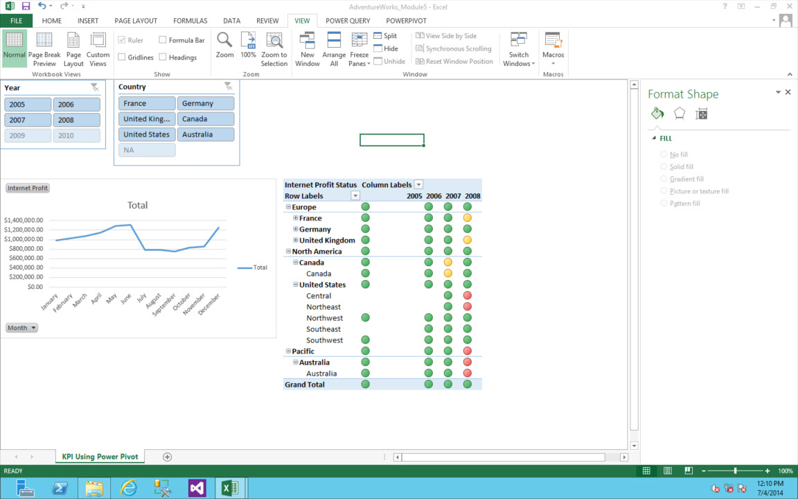
Key Performance Indicators can vary greatly by industry, depending on the criteria that determines their priorities or success criteria. KPIs are also known as Key Success Indicators (KSIs). Essentially, KPIs are used to assist organizations to evaluate their success or measure the progress of an activity (e.g. sales) they are engaged in. While this is a broadly used description of what a KPI is, I prefer this explanation “KPI’s are an actionable scorecard that keeps your strategy on track. They enable you to manage, control and achieve desired business results.” – BarnRaisers
In the context of Power Pivot, KPIs reveal the progress and status towards an established goal. As demonstrated in the image below, we show the Internet Sales Profit vs. the Internet Profit Goal for the year (2008) and for all Countries.
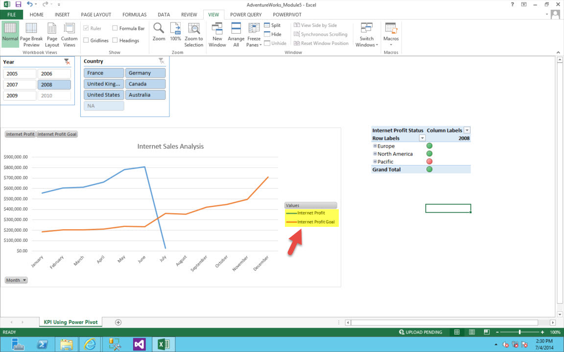
Slicers are one click filtering controls that graphically narrow the scope of the data represented in Pivot Charts and Tables. Slicers are used to interactively narrow the data to display the changes when the filter is applied. For example, in the image above, the Year and Country slicers appear in the upper left-hand corner. For the Year slicer 2008 is selected and results in displaying the Internet Profit and Internet Profit Goal for the months in 2008 and all countries in the Internet Sales Analysis chart.
Adding a slicer to your report is very simple to accomplish. To add a slicer perform the following steps:
- In the Excel window, click anywhere in the Pivot Table window to get the field list to display.
- Highlight the field in the Fields List you wish to create the slicer on.
- Right-click and select Insert Slicer.
Because slicers are a graphic objects in Excel, they can be moved, re-sized, and even deleted if they are no longer needed.
In subsequent posts, we will explore the different solutions and how KPIs are set up in each one. We will look at solutions using SSAS Multidimensional, SSAS Tabular, Performance Point, and PowerPivot. See you soon.
Leave a Reply